


Brand Identity
Brand Guidelines
Everything you need to use the Oyuneks logo, colors and mark correctly. Prepared for press, partners and streamers.
01 · Logo
Logo
Standard usage and the mark on its own
Standard
The standard logo should be used in full color whenever possible and as a complete unit together with the logomark.

Logomark
In cases with limited vertical and horizontal space, the logomark can be used on its own, without the logo text.

Contrast
When the green of the logomark has weak contrast with the background, a solid white version can be used.
02 · Files
Logo Files
Five variants by use case, PNG and SVG


03 · Colors
Color Palette
Click to copy the hex codeOyuneks GreenBrand color · Primary action, accent
Oyuneks PurpleBrand color · Contrast background, secondary action
Off WhiteAccent · Light background, behind the mark
Electric PurpleAccent · Campaigns, attention-grabbing background
Dark GreenFunctional · Success, confirmation
Midnight PurpleFunctional · Dark background
Light GrayFunctional · Disabled, divider
Neutral 900Body background
Neutral 800Card background
Neutral 700Border
Neutral 500Secondary text
04 · Rules
Sizing & Spacing
Minimum size and clear space24
Minimum height 24px
To ensure legibility, the logo should not be used at a height smaller than 24 pixels.
2x
Clear space: twice the text height
For more comfortable use, leave clear space around the logo equal to at least twice the height of the logo text. Never combine or overlap the logo with other elements.

05 · Mistakes
Common Mistakes
Do not do these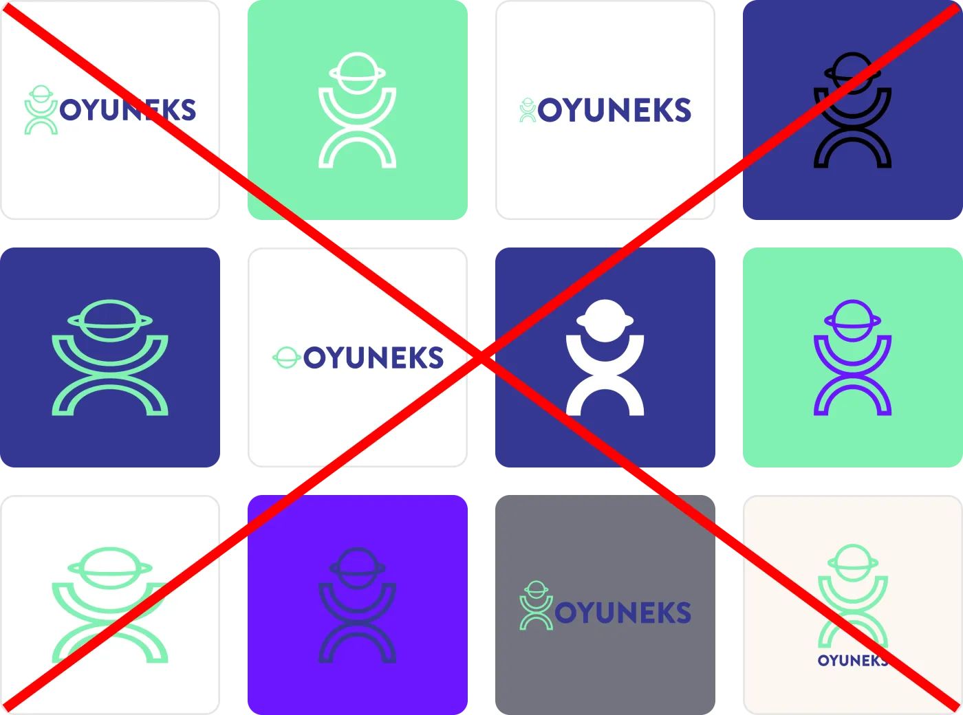
01
Shrinking the logo and placing it out of proportion
The logo never goes below the minimum size; clear space is kept
02
White mark on a green background
The mark disappears on the brand green; use purple or a dark background
03
Squeezed logo with wide margins
The logo area is not left empty with a tiny logo inside
04
Black (single-color) mark
The mark can only be green or white
05
Green mark on a purple background
Use the white (knockout) version on contrast backgrounds
06
Reducing the logotype to a single color
Text and mark keep their own colors
07
Filled (solid) mark
The mark is a line form; it is never filled
08
Purple mark on a green background
Only the white mark is used on the brand green
09
Showing only the mark, faded or too small
The mark may stand alone, but at a legible size
10
Purple mark on purple
The mark becomes invisible within the same color family
11
Standard logo on a gray background
Contrast drops on neutral gray; pick the light or dark version
12
Stacking the mark and text vertically
The logo is never rearranged; the horizontal composition is fixed



